Company
CI & Organizational Structure
Genuine Parts & Genuine People
Brand
Glozen is a combined word of “Global” and “Zen”, which signifies an oriental superiority in the world.
It also implies that the Company is confident of supplying best products and becoming a global leader.
Symbol
A highly intuitive square symbol is designed to highlight Glozen’s integrity, accuracy and reliability.
A simple but strong red color implies Glozen’s unified identity and communication.
Typeface
In response to various and dynamic factors (e.g. brand awareness, communication, etc.),
Gothic was chosen to represent Glozen’s unique brand identity and its commitment to accuracy.
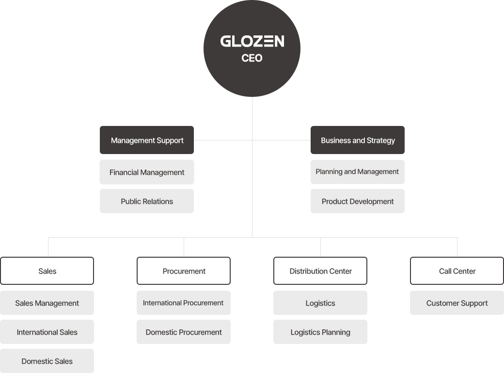
Refer Organizational Structure Image Here